Brand Identity
Brand Identity
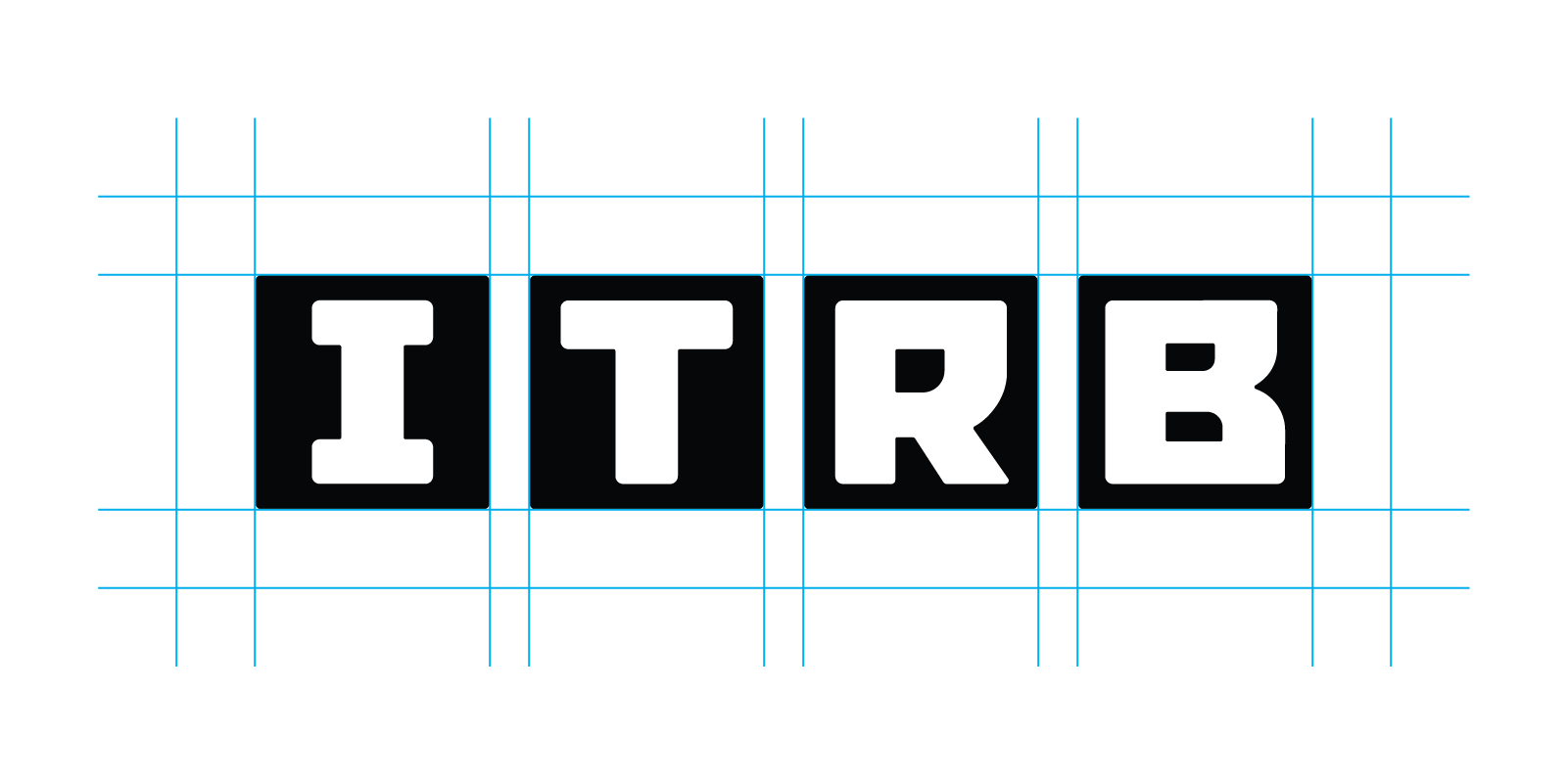
Here you will find the official logo versions prepared for different formats and contexts. Choose the white or dark version depending on the background to ensure optimal contrast and recognizability.
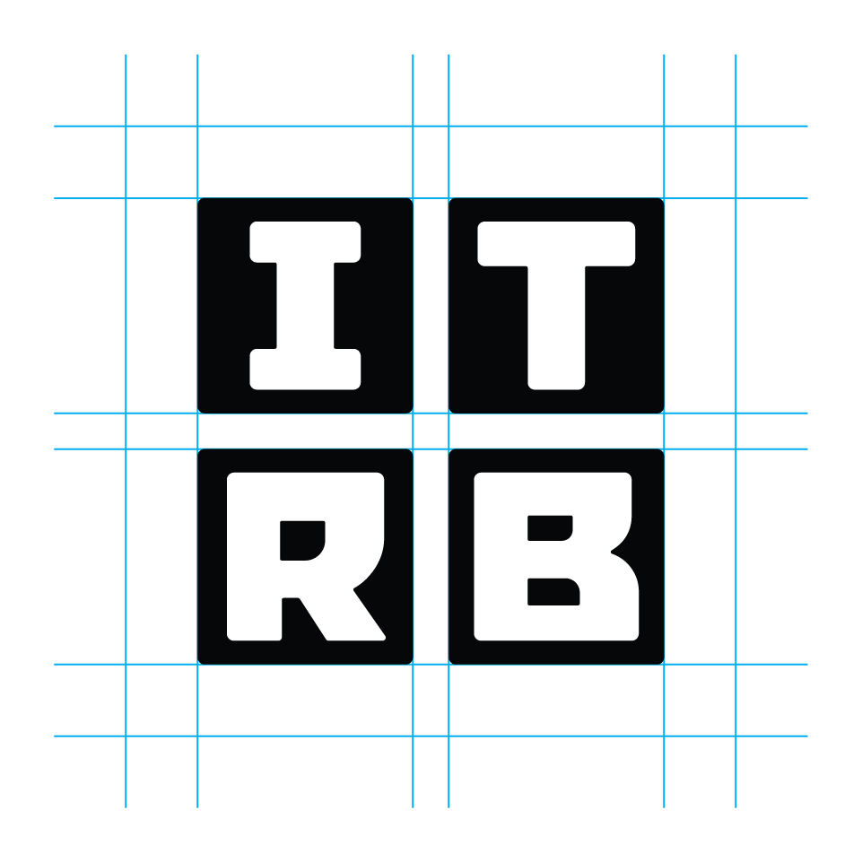
The primary logo for use is the horizontal version; the vertical or square logo serves as an alternative for narrow or tall formats.
Use the horizontal versions for banners and wide layouts, and the square versions for spaces with limited room. Always maintain the required clear space around the logo.
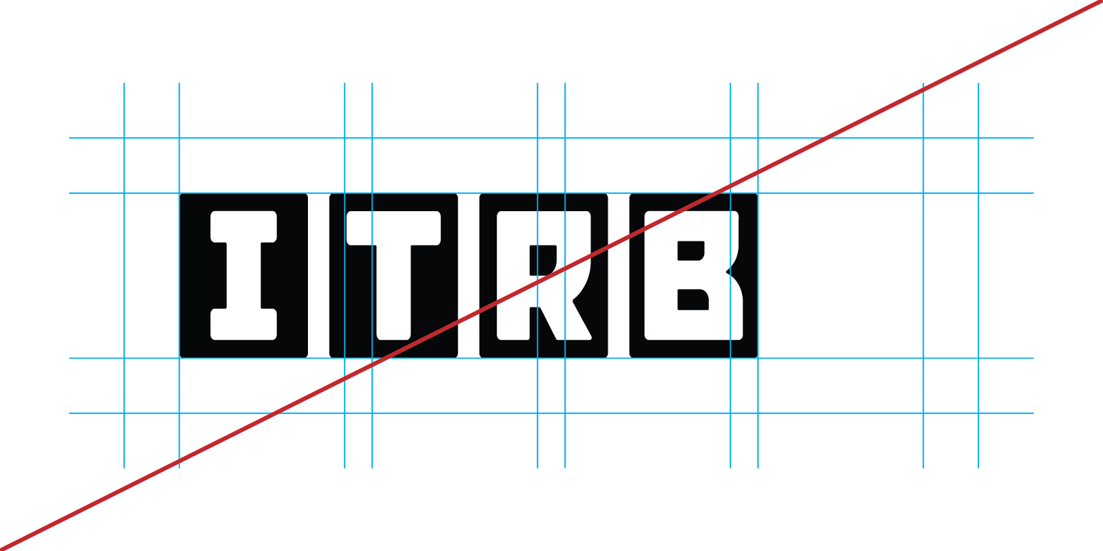
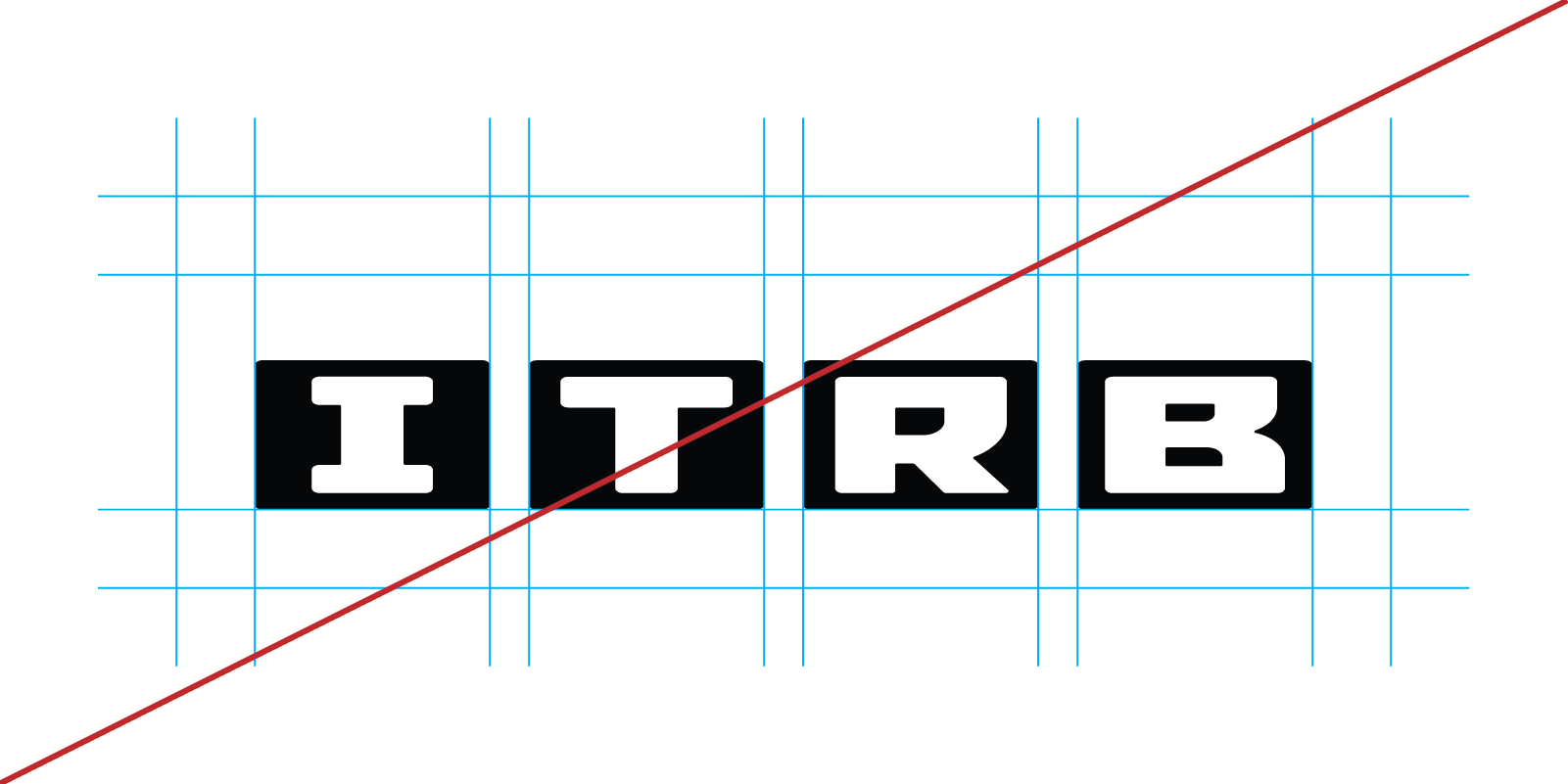
Incorrect logo scaling and distortion of proportions should be avoided, as shown in the examples below. Please preserve the logo proportions and safe area during scaling and positioning to maintain brand recognition.


Examples of incorrect logo usage are shown below.
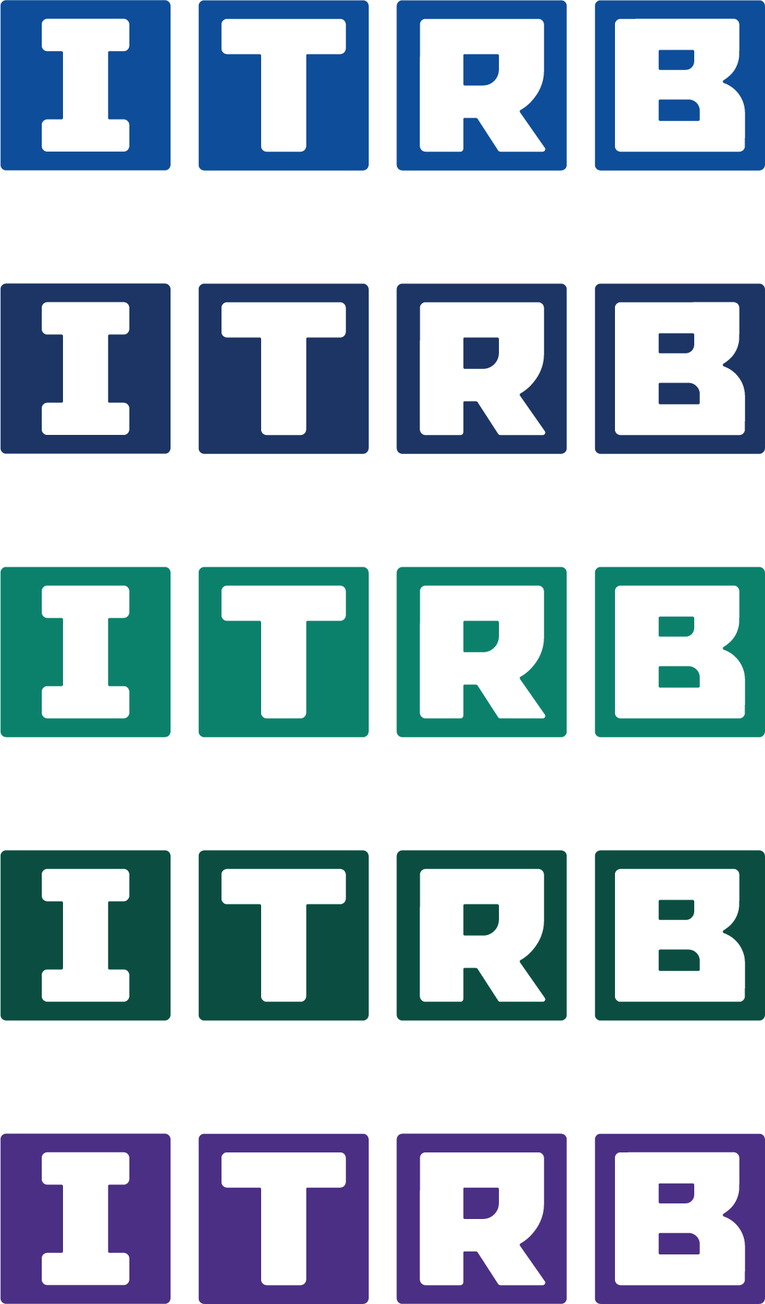
These versions represent the primary color sets. Use them as a reference when selecting backgrounds, accents, and color combinations across different materials.
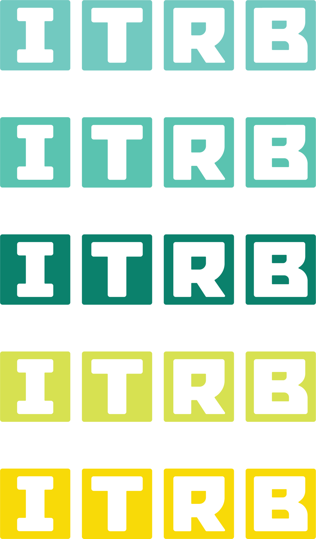
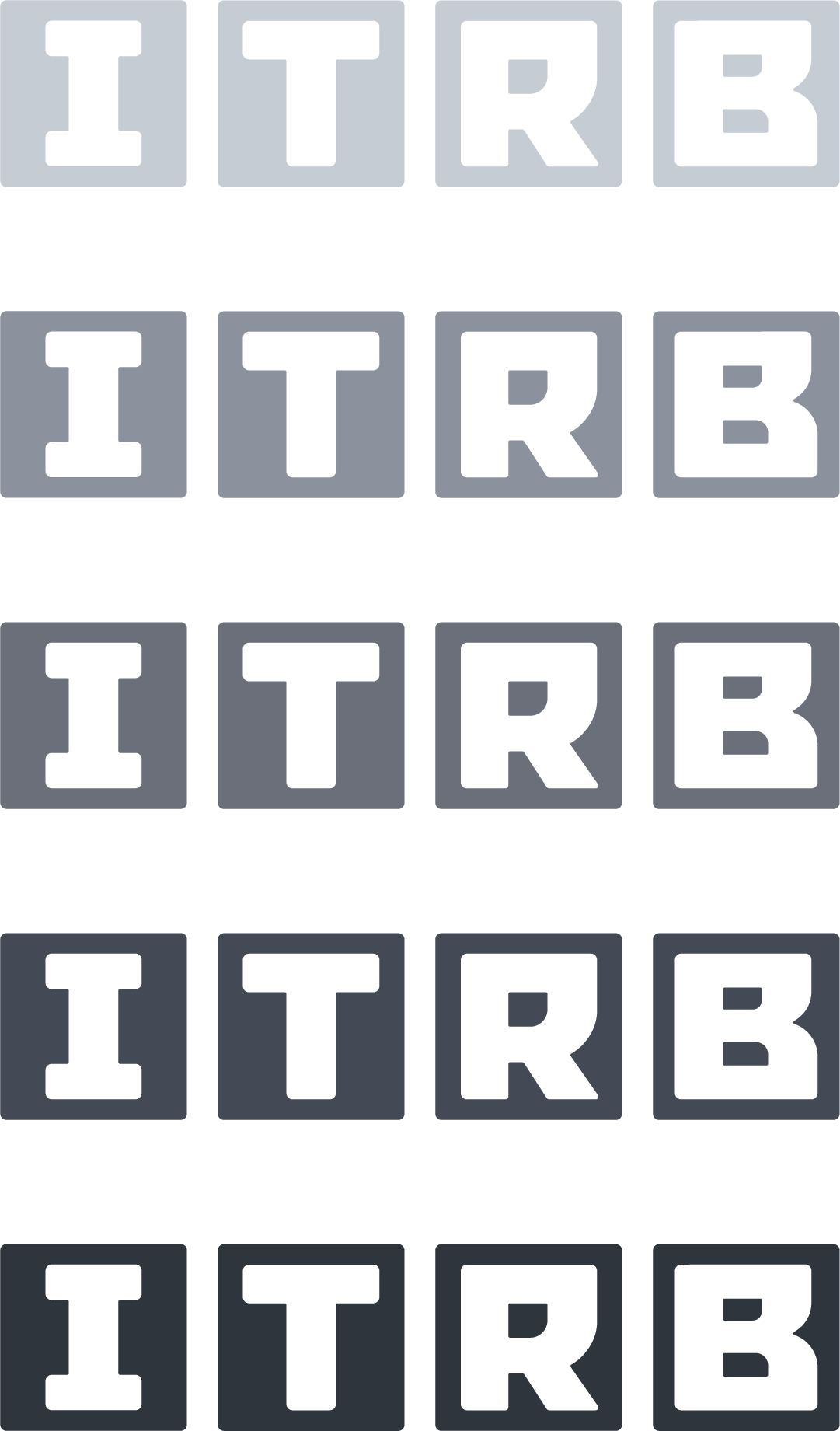
Here you will find the primary brand colors and accent tones that form the visual identity of ITRB.
Use them consistently across web, print, and presentations to maintain a unified tone and brand recognition.
The palette has been selected to ensure strong readability and contrast across different backgrounds — from interface elements to large banners and marketing materials.
There are no strict limitations when combining colors from the palette with backgrounds. Accent colors should be used moderately to preserve the visual harmony and recognizability of the brand.
Sofia Sans is our primary typeface, selected for its modern aesthetic and excellent readability. It gives our brand a professional yet approachable appearance and adapts well across different sizes and media.
Below is a brief overview of the typeface at different sizes — from small interface values to large headings.
This will help you evaluate readability and visual context across different use cases and formats.
The example below illustrates the typeface usage at various sizes.
This example demonstrates how the typeface is used in meaningful combinations according to the purpose of each individual element.
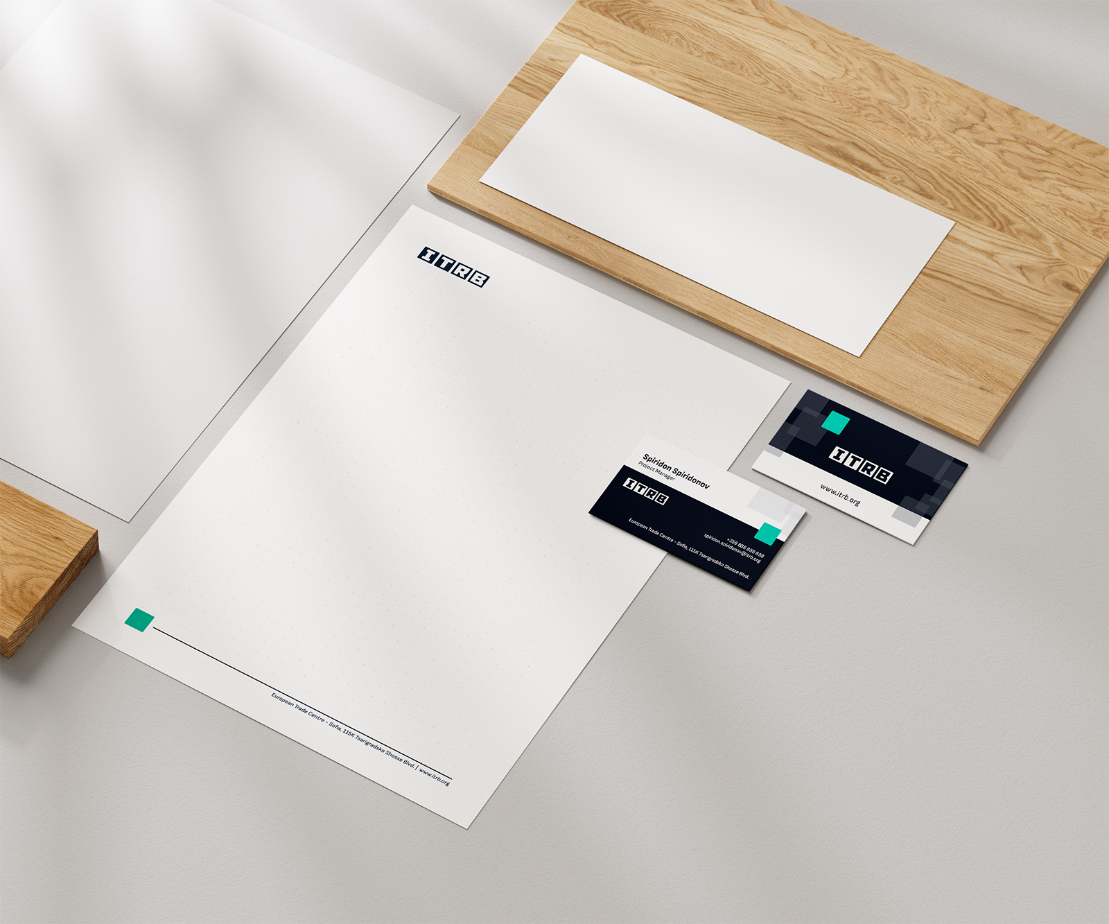
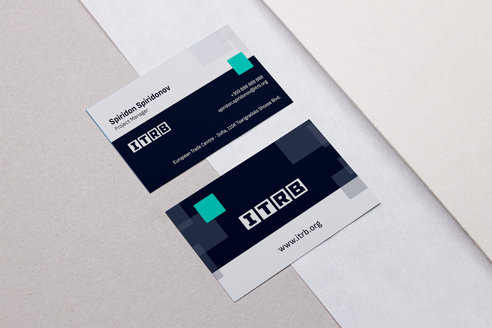
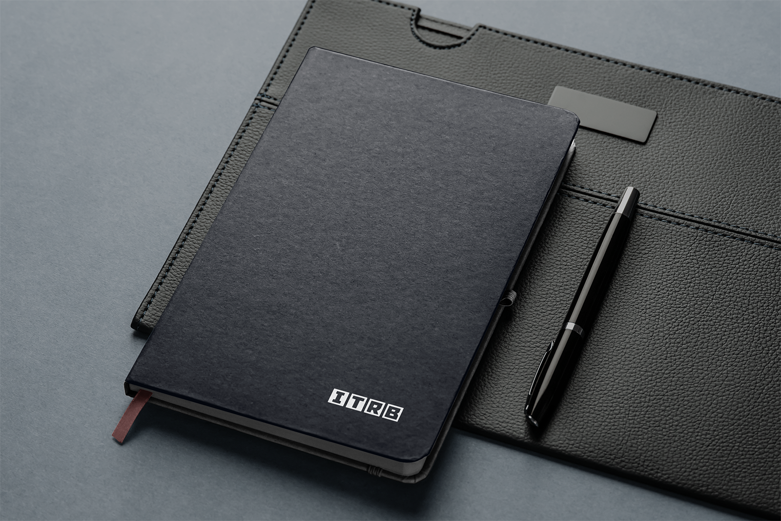
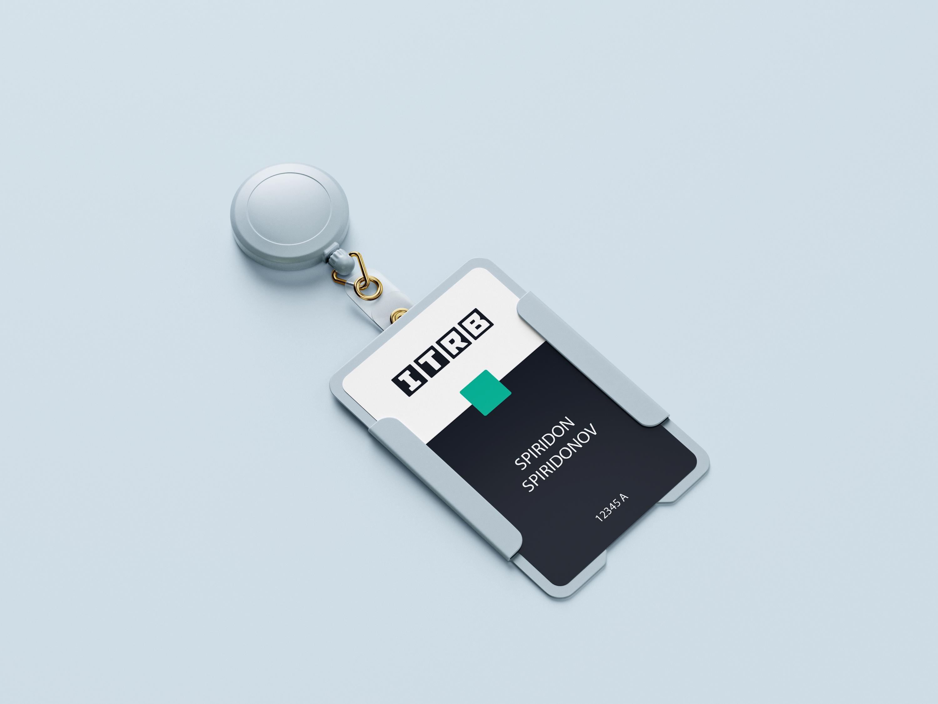
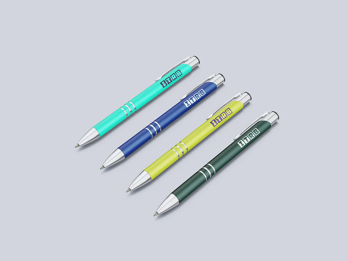
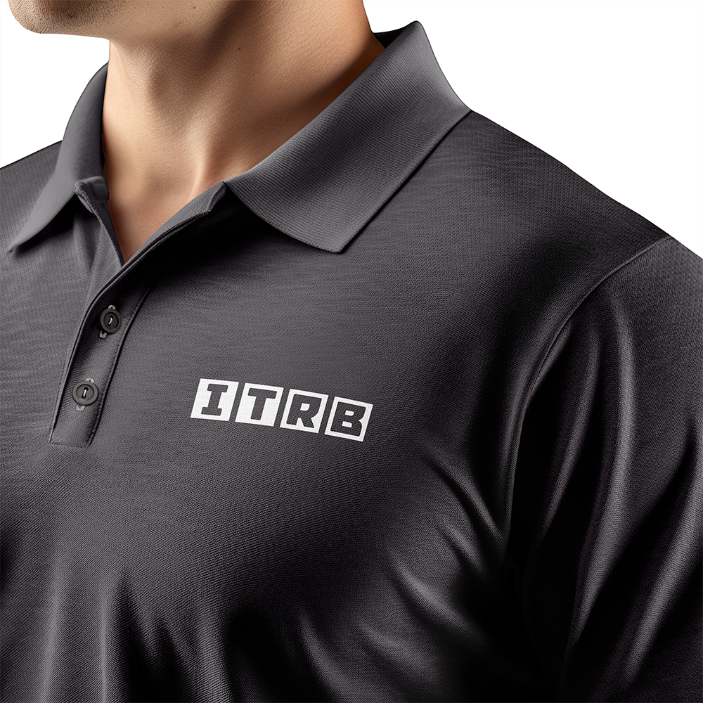
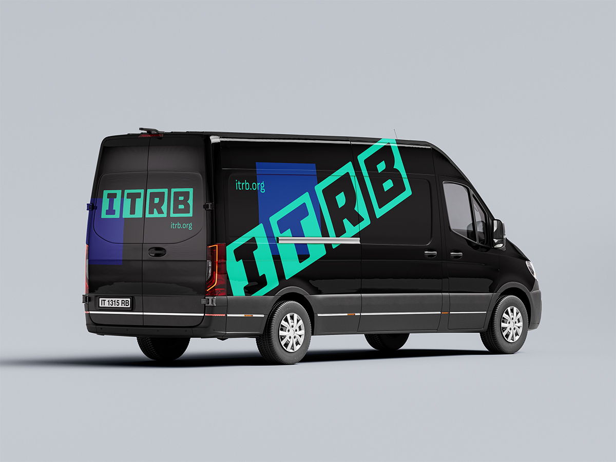
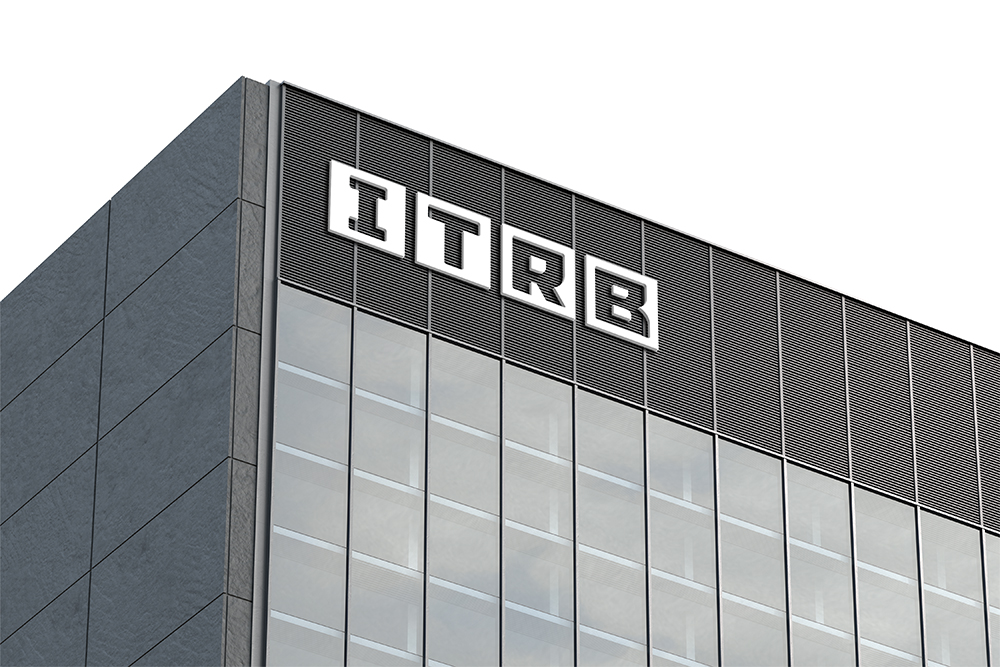
These examples demonstrate how the brand elements — logo, colors, and typography — are applied across real products and materials.
Use them as a reference when preparing print and production materials: maintain the logo proportions and safe area, and use the specified color values for accurate reproduction.
A favicon is the small icon displayed in the browser tab, bookmarks, and browsing history. Using the official ITRB icon strengthens brand recognition whenever the website is opened or a page is saved.
Below are the recommended favicon sizes and usage contexts. Follow them when integrating the favicon into websites and applications to maintain a consistent visual identity.
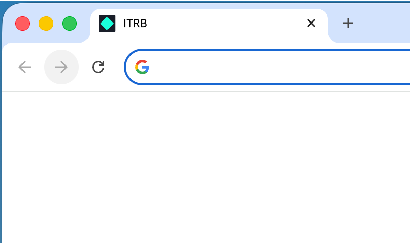

16×16px
Browser tabs
32×32px
Bookmarks & high-DPI
48×48px
Desktop shortcuts
64×64px
App icons
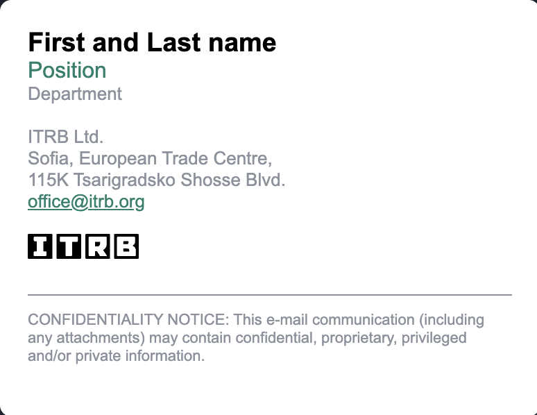
The official ITRB email signature includes the logo, contact details, and optional social links. Using it across all corporate emails helps maintain a professional and consistent communication style.
Use the provided template when configuring email clients (Outlook, Gmail, etc.) and do not modify the proportions, colors, or arrangement of the elements.